UX fails – even Apple is not immune.

I am amazed for all the brain power Apple has in its engineering team, they still manage to provide bad user experience in some cases. General consensus in the industry is Apple Hardware and Software just work together and delight the user in ways which we would not imagine.

Not always.

Allow me to elucidate.

Back in 1990’s the biggest frustration I used to have as a gamer was not able to fit the massive games ( > 5MB) into storage media like floppy disks. (I made myself look like a dinosaur, I know!). MS-DOS and Windows had a nasty habit of not letting you know how much space is available before you start a copy process and would miserably fail half way through.

Fast Forward to 2015. I am using iOS 8.1.3, the world’s most advanced operating system ever (I didn’t say it, Cook did). All I did was try to shoot a video of my 6 week old smiling using my 64 GB iPhone. The camera app was recording the video and right when the baby was starting to coo and cackle, I get this nasty error dialog which said my device ran out of storage space and the recording was stopped. (Thank the lord, it did record some of the footage).

I just don’t understand how the world’s most advanced operating system, cannot provide a word or warning when it starts running out of space. It doesn’t have to be an automated nag, but having a visual clue on the camera app which shows how many pictures are possible or how many minutes of video can be recorded with the available space would be a good visual clue.

Go ahead and highlight that in red when you are running out of space to let the user know that they don’t have enough space to record baby video and its time to delete that Angry Birds V1 app which is taking up close to a GB of space.

And while you are at it, why not give some more smart recommendations like the age/usage of apps on the phone? If I haven’t touched an app in months and its taking up valuable storage space, maybe its time to provide some advice to the user to delete that bloat.

What are the other UX annoyances you face with your favorite Device/OS?

PS: If you are frustrated with other OS annoyances, this Quora Thread has a laundry list of things which iOS sucks at.

http://www.quora.com/What-are-the-best-examples-of-poor-Apple-user-interface-design

UPDATE: Just a few minutes after I publish this post, I see this news about Apple working on revamping the stability of their OS  – Good news!

Apple’s iOS 9 to have ‘huge’ stability and optimization focus after years of feature additions

Paypal needs to leave 1998 and move on to 2015.

I rarely use PayPal. The only times I use PayPal is to buy from Internet merchants who I have never dealt with before. I never use their money movement feature. That being said, a couple of months ago I decided to add a new bank account to PayPal.

A typical way to setup a new bank account for ACH is utilizing the trial deposit method of account verification. With this method, the entity which likes to make the ACH linked setup, sends two micro trial deposits usually less than a dollar to the bank account and asks you to verify this amount. This process takes typically a day or two due to the underlying limitation of the ACH technology which uses batch files in this day and age to settle transactions.

Recently a newer way to verify bank information has been floating around – this is called Instant Verification where the entity (like Paypal) utilizes the online banking login information to confirm if you really are the owner of the account you are trying to link. I have used this method in a few places and 99% of the time, unless you are trying to link to one of the big banks, this never works. (In which case I fallback to the trial deposit method).

So when I set up a new funding bank account with PayPal using this new Instant Verification method, I was surprised to see it was able to connect to a small local credit union account. However I realized a few months later, instead of linking the checking account, PayPal ended up linking the savings account. (Disclaimer: I am not sure who screwed up here, PayPal or the aggregator they use or my credit union’s core system).

During holiday shopping season I used Paypal a little more than normal. This ended up deducting  from my savings account (which didn’t have much balance on the first place since this bank account is purely used for everyday spend).

At one point, the savings account over drafted and PayPal hit me with a $20 fee for the failed ACH transaction (even though I have a backup credit card setup within Paypal to fallback in the event of ACH failure.

Transaction from my bank on 12/23:

Screen Shot 2014-12-30 at 8.09.45 AM

Not wanting to deal with PayPal’s customer service, I decided to remove this bank account from PayPal and just leave it only with a credit card as funding source. When I try removing the bank account, I get an error message that “You have a pending transaction – you cannot remove this bank account”.

Screen Shot 2014-12-30 at 8.10.40 AM

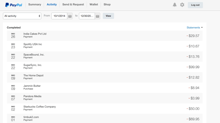
I give PayPal a full 5 day window and try removing this account and I got the same error message again. To add insult to injury, I can’t seem to locate the $20 fee or the Pending transaction within PayPal Account Activity Section.

Here is PayPal’s account history where you can’t see the $20 fee or a Pending transaction:

Screen Shot 2014-12-30 at 8.16.16 AM

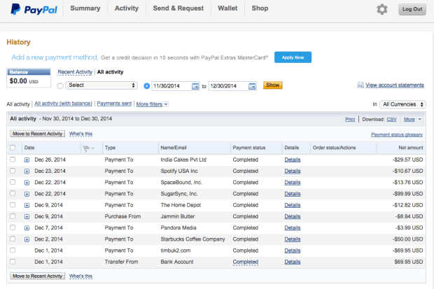
I even tried the Ugly Sister version (Classic Site) of PayPal to see if this Pending Transaction and hidden fee are visible – no luck.

Screen Shot 2014-12-30 at 8.18.32 AM

I can’t believe PayPal, a massive platform with so many customers would suck so bad on User Experience. I wrote to PayPal Customer Service, lets see what that response would look like 🙂

Update 1 on Jan 1, 2015.

PayPal sent me a generic email about how to add and remove bank accounts when I specifically asked them to remove a bank account. Auto Responders are not cool – especially when you deal with customer’s money.

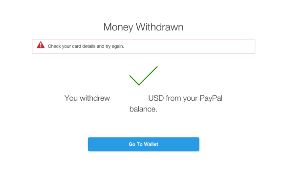
I tried moving some money from the PayPal account to my bank account. It seems like the transaction went through but this is the confirmation screen I got after the transaction. I got an error message to check my card details followed by a big green check mark possibly indicating that the money transfer was initiated. What does this even mean?

Screenshot:

Screen Shot 2015-01-01 at 2.37.36 PM

To facilitate this move, I had to increase my monthly transfer limit. PayPal cleverly suggests that we add another credit or debit card to do this. I added a new card to increase my limit. PayPal charged me an amount of $1.95 to validate if the card really belongs to me. In the transaction memo they embed a 4 digit code which needs to be used to validate that the credit card belongs to me.

Once I finished adding the card, I got a realtime mobile SMS alert from my FI and I added the 4 digit code to confirm that the card was mine. After that I was able to move the money from PayPal to the bank account. However, when I viewed the account register again, instead of seeing a credit and a debit for the $1.95 which PayPal posted, I see two credits to my account. SMH.

Screen Shot 2015-01-01 at 2.47.15 PM

Does this company even do any Quality Assurance Testing on the code they push to production?!?!